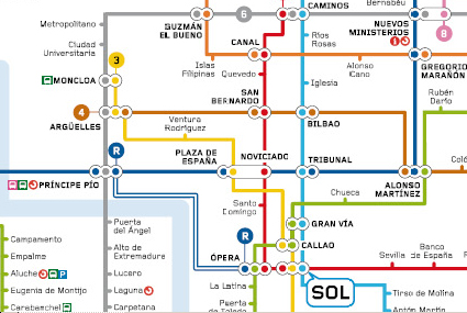
Personally I think the new one (detail immediately below) looks much clearer than the old one:

Detail of New Madrid Metro Map

Detail of Old Madrid Metro Map
However, if you know Madrid there are some unsettling oddities. According to the FT, the designer, Rafa Sanudo, makes the standard Line 1 journey from Pinar de Chamartin to Valdecarros "seem as though you're on some weird escalator".
Max predicts: "It will last three or four years, until the person who commissioned it moves on. Then they'll change their minds."
I'm sure we'd get a similar "up in arms" reaction from the UK if the Tube map lost its curves & 45 degree angles and went all spiky overnight. Even Max's own curvy Tube map bought mixed reactions when blogged here.
Apparently Madrid's map "has slipped the surly bonds of reality completely. All diagonals are banned, which makes it very uncompromising." But my favourite part of this story is hearing about the guinea pigs that the map's designer, Rafa Sanudo, used as a sanity check for the map: "He said he tested it on his mother-in-law and her bridge partners, which sounds as good a focus group as any other, and cheaper than most. But perhaps they don't get out much."
Check out the full FT feature here.
No comments:
Post a Comment