Manhattan Subway Map by Guillermo Esteves
"Staten Island, meanwhile, will shrink by half. The spreadsheetlike “service guide,” along the map's bottom border, will be eliminated, and the other three boroughs will grow to fill the space." said the New York Times
Like our Tube map, the locals are finding that their subway map has become overcrowded over time. "In its desire to be complete and provide a great deal of information, it took away from some of the clarity you would have with a simpler map," said Jay H. Walder, the Metropolitan Transport Authority’s chairman.
Walder felt that service guide which showed the weekend schedule, was theoretical at best. This will be removed along with a growing list of handicapped-accessible stations that had begun to dominate the bottom right corner. As with our London map small wheelchair symbols will continue to denote those stops.

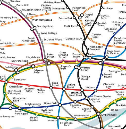
I wonder if TfL were consulted over this project? Map expert Maxwell Roberts has long been arguing that our Tube map has lost its way and needs simplification.
He "believes we've now got to the state with the map trying so desperately to please everyone (wheelchair access, station closures, partial station closures, zones, future extensions), that it has become a bit of mess. The network has grown so much that even Harry (or rather Henry) Beck would have tearing out his hair.
Now more than ever we can see the tension between the map's need to be legible, usable, attractive and simple and its counter need to convey information. The addition of Cross Rail and the Olympic Line will only make matters worse."
Will there come a time when we see certain parts of London expanded on the Tube map? Will other parts be reduced? How do you balance humanity & familiarity with the complexity of the system?
Hat tip to Jemimah Knight for finding this.
No comments:
Post a Comment