On Tuesday night I went to Max Roberts' excellent talk about the Tube Map after Beck, hosted by the London Underground Railway Society. It's remakably hard to summarise an informative and fascinating speech in a blog post and if you missed it, I'd suggest you try to hear Max speak again or buy his book "Underground Maps after Beck".
When I last heard Max speak he gave an extremely entertaining round up of various countries versions of the Tube Map - mainly when they were too tight to pay TfL for the rights to use the map. But on Tuesday he talked about the development of the map in London itself post Beck.
It was quite an eye-opener to me that politics, passenger numbers, branding, customer pressure and Collins diary could have as much an influence on the make up of the map as the physical reality of the stations and lines.
For instance, you might be puzzled as to why the North London Line (which isn't actually part of the London Underground) is on the Tube Map. It's the result of some of the first "map mashing" that we've seen. In the early Seventies there was a passenger campaign to get the North London Line included on the map. Interested parties put stickers superimposing the line on as many station maps as they could.
The campaign culminated with a letter to The Times on the 6th November 1972, declaring their outrage as to why the map didn't contain this line. They were very proud of their sticker work on the map and concluded by saying that "London Transport could not have done this better themselves even if they wanted to".
In 1977, the GLC finally gave in and also wanted to give publicity to the line so it was put on the Tube Map. But you'll notice from then the North London Line did a bit of a "now you see it, now you don't" act, depending on London Underground's mood at the time.

Block capitals used to mark important station names, but as Max said "Even Chigwell station is important to some people". This led to everything going CAPS LOCK in 1977, which put diary manufacturers into a bit of kerfuffle, as the map grew in size and when reduced to fit diary pages, the typeface became too small to read. Not wanting to lose out on the free publicity from diary manufacturers (this was before LU started charging for the reproduction of the map), London Underground produced a separate version for diaries, leading to loads more complaints from staff and the public alike and calls for one definitive version.
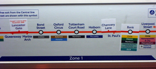
Max believes we've now got to the state with the map trying so desparately to please everyone (wheelchair access, station closures, North London Line, partial station closures, zones, future extensions - how many more stickers will the Central Line need?), that it's become a bit of mess. The network has grown so much that even Harry (or rather Henry) Beck would have tearing out his hair.
Now more than ever we can see the tension between the map's need to be legible, usable, attractive and simple and its counter need to convey information. The addition of Cross Rail and the Olympic Line will only make matters worse. Take a look at TfL's own projection of what the Tube Map could look like in 2016 and you'd need a pretty big diary map to cope with that.
Before joining commenting regulars, Jon Allen, Mr Justice, Alantan for a quick post-talk bevvy, I had a brief chat with Max. We'd been emailing about the possibility of Max doing another talk in the future as he's got more than enough slides and entertaining stories to speak elsewhere. So watch this space for details and let me know if you'd be interested in seeing him next time he's in town.
No comments:
Post a Comment