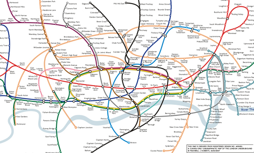
"Thanks to all the comments on Version 1 of 'Curvy Tube Map', many suggestions have been taken into account. My station marks caused controversy before, and this time round I have tried circles, but still directional. The gradient fill was always deliberate; for people following lines, they alert the presence of a station, and give a little bit of 'lift' to the map. Plain circles look drab, standard tickmarks would be completely out of keeping.
Version 2 was quite a challenge. The risk with many lines on an all-curves map is a flailing seasick-inducing tangle. People expected to see the "tangerine octopus" added (as named by diamondgeezer) but these lines have to blend in seamlessly and not draw the eye from the most important part on the map, the centre. For Overground, with all that overpowering orange, I ended up running the lines underneath the Underground lines. This diffuses the orbital mass of colour just enough. Purists will object, but take a look at the current official map, where which line goes above or below Overground seems to be random.
The routes taken by Overground seem to flow well and adding them has not damaged the routes of the Underground network. In fact, the centre of the map has been completely reworked, and compared with Version 1, every line has a better route. The Northern Line West End branch was sacrificed in the process, but it still seems happy."

"So, does this map 'work'? With extra railways on it, the simplicity of Version 1 has been diluted, and the map needs a bit more mental effort to make sense of it (as for any complex map). I think I have shown that there may well be some mileage in designing maps in this way, but die-hard Beck fans will not be convinced. On the other hand, it's hard to know just how bad the design of the current official map has to get before they would be."
Again I think that Max has done a good job with this, particularly with the complexity created by the extra lines. As before Max is very interested in hearing your thoughts, and answered all your comments on the previous verison. If you want to see more of the whole map click from here.
No comments:
Post a Comment