"What would Beck himself have done? A man of vision as well as courage – and a pragmatist if ever there were one – he might well have recommended something drastic, even iconoclastic: tearing up his own Underground map, and suggesting that we begin again from first principles. No doubt this would be an occasion as emotionally charged as the introduction of decimal currency was nearly 40 years ago, but it might be the only rational thing to do." Thanks to richjm for the heads up.

From www.boardello.co.uk
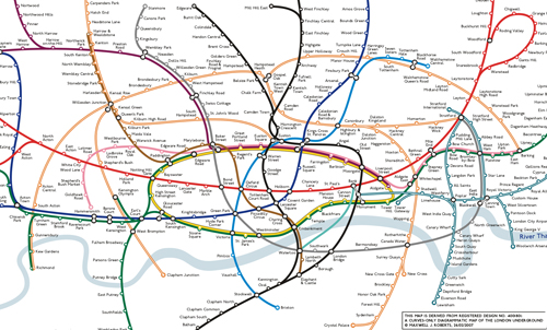
A few years ago, I went to a talk that London Underground map expert Maxwell Roberts. He had similar thoughts. I wrote:
Max believes we've now got to the state with the map trying so desperately to please everyone (wheelchair access, station closures, partial station closures, zones, future extensions), that it has become a bit of mess. The network has grown so much that even Harry (or rather Henry) Beck would have tearing out his hair.
Now more than ever we can see the tension between the map's need to be legible, usable, attractive and simple and its counter need to convey information. The addition of Cross Rail and the Olympic Line will only make matters worse. Take a look at TfL's own projection of what the Tube Map could look like in 2016 (with Boris's arrival this projection no longer exists) and you'd need a pretty big diary map to cope with that.

What's the solution? If designers went back to the drawing board would they go curvy as Max Roberts recommends?
Max said "So, does this map 'work'? With extra railways on it, the simplicity of Version 1 (his earlier version) has been diluted, and the map needs a bit more mental effort to make sense of it (as for any complex map). I think I have shown that there may well be some mileage in designing maps in this way, but die-hard Beck fans will not be convinced. On the other hand, it's hard to know just how bad the design of the current official map has to get before they would be."

Will the design team board™ have their way with a proposed 2012 Tube map based on Olympic rings (see first image) - they say "recent usability feedback has been very positive." Would going geographical help or hinder? Has the map got so bad it needs a total re-design?
No comments:
Post a Comment